Project 4 Title Page


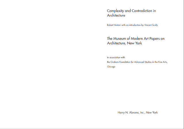
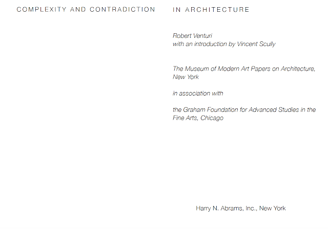
Process: For the title pages, I wanted to create clarity and hierarchy between the content. Considering the restrictions, for the first composition, I made things fairly simple but also having the text stand out by utilizing the all caps options. I aligned the whole spread in the center, to really give the clean cut look. For the second composition, I ditched the idea of all caps, and replaced that with different type sizes (per the restrictions). I aligned all the text to the left, except for the last line of text, because I felt that it should stay aligned in the bottom center for all of the compositions. For the third composition, I used the entire 2 pages to enforce the hierarchy of the title. I utilized the option for all caps, as well as grouping the rest of the information together in an italicized weight. I enjoyed creating the final composition because there were basically no restrictions, besides using the provided typefaces. For this composition, I enforced the hierarchy with a border around the title, and rules for the rest of the content. I felt that keeping everything center aligned would keep the entire title page clean, while there was a lot of other things going on with the rest of the content.
Comments
Post a Comment